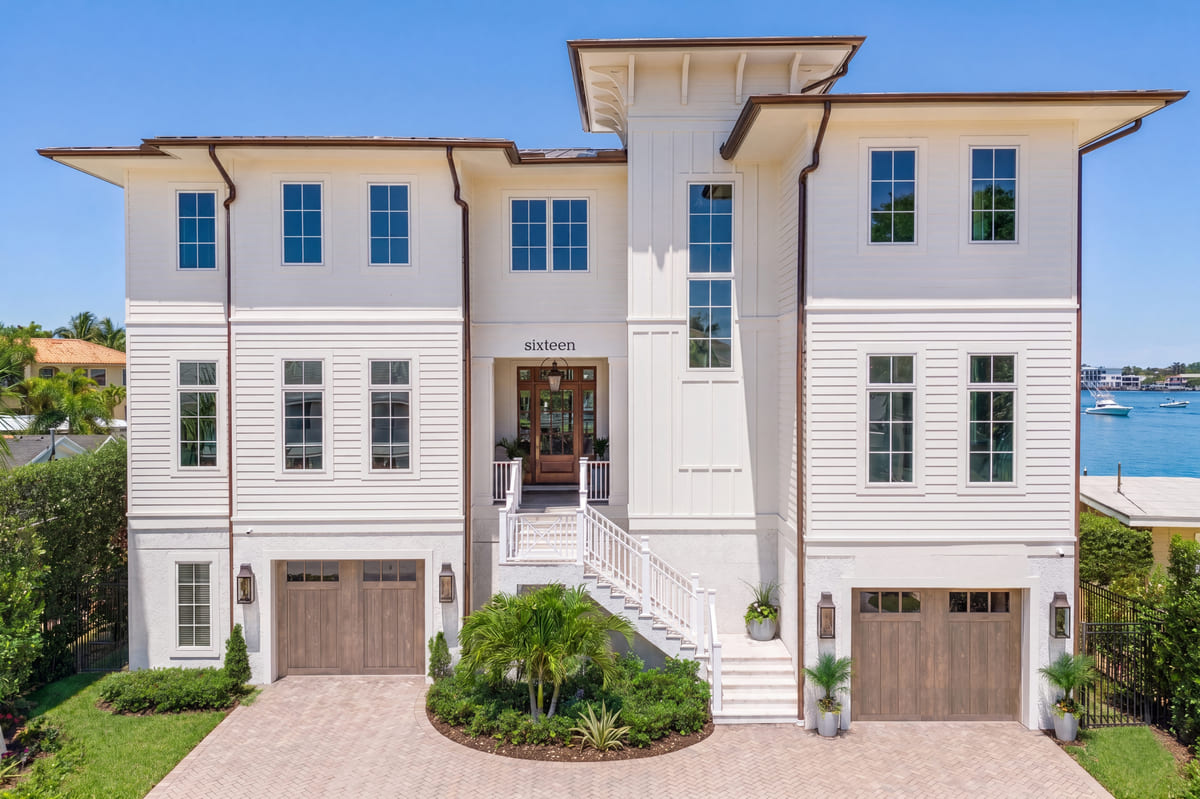
Leslie Saul & Associates specializes in additions and renovations. The team of architects and interior designers thrives on challenging assignments in the New England and South Florida areas.
 Photo Credit: Williams College
Here, Principal and founder, Leslie Saul, explores the color green, its word associations and uses within interior design.
I’ve been asking people what the first three things that they think of when they hear the word, Green. Here are some of the responses that I have heard, clustered into 7 categories:
Verdant: trees, leaves, bushes, plants, grass, moss
Energy efficient: low carbon footprint, recycling, composting
Vegetables/foods: lettuce, spinach, broccoli, peas, parsley, Pistachios, mints
Sports: Baseball’s Green Monster at Fenway; Tennis courts; Golf
Camouflage: (although it’s not green anymore)
Hospitals: (although that is rare these days)
Traffic Lights: Go, The opposite of Red
As a designer who loves color, the first thing I think of is COLOR!! I was interested in learning about Green Pigments. Where do they come from and how long have green pigments been in use?
 Photo Credit: Leslie Saul & Associates
Let’s start with Neolithic Cave Art. There is no visible use of green pigments in the caves, but at the same time period, Northern European people made a green dye from the leaves of Birch trees. Ancient Egyptians made a green hue from finely ground malachite from about 4,000 BCE. To the Egyptians, green represented regeneration, and rebirth.
Ancient Romans used Terre Verte, green earth, a natural pigment. To the Romans, green symbolized Venus, the goddess of gardens, vegetables, and vineyards. Terre Verte can be seen in the first century frescoes at Pompeii, Herculaneum, and Dura Europos, in Modern Syria. The pigment was used in combination with Verdigris, the green of Greece, which was made by steeping warmed plates of brass, copper, or bronze in vats of fermenting wine or vinegar. The copper carbonate was removed from the metal plates and dried for the base of the pigment. Verdigris was ephemeral and practically disappeared over time.
Malachite and verdigris were in use through the Middle Ages, illuminating manuscripts, also in the Flemish painter Jan van Eyck’s famous 1434 painting, The Arnolfini Portrait.
When German-Swedish chemist, Carl Wilhelm Scheele, created what was known as Schloss Green in 1778, it quickly eliminated the use of Verdigris. In the 19th century this pigment was used extensively by paint and wallpaper manufacturers. Unfortunately, these beautiful shades of willow, forest, and sage contained the poison arsenic, which leached from the wallpaper into the air, leading to the deaths of people who spent a lot of time in rooms with these wallpapers, including Napoleon Bonaparte while he was in exile. Emerald or Paris Green was another arsenic-derived green pigment developed in 1814 by German Chemist Wilhelm Satler. For obvious reasons, none of these greens are available today.
 Photo Credit: Greg Premru
Some of the artists well known for their use of green include early 19th century artist John Constable, for his beautiful landscapes, late 19th century painter Paul Cezanne, who said, “A touch of green is enough to give us a landscape.” Early-mid-20th century artist Rene Magritte, for the green apples in his dada/surrealism style paintings.
I’m tempted to go to my art studio right now and mix up some greens for my next painting! I think we all can use a little re-birth and regeneration after our years spent in pandemic stress.
Do you have a design or color challenge you need some help to solve? Is there another color that you would like to know more about? Please contact me at Leslie@lesliesaul.com or koko@lesliesaul.com