Haute Residence: Why are these two elements such an important part of your design work?
Joe Human: Color and pattern are my two favorite design elements to play with. The kid inside of me that wants to portray spaces in a fun and artistic way, yet the adult side of me desires them to be sophisticated as well. Also, growing up in Idaho, there was a lot of beautiful nature, the term “God’s Country” is a great description of the wonderful landscape, with its colors, textures, and patterns. Yet, the residential design seemed so lackluster and unimaginative with plain beige and brown everywhere you looked. I really wanted to have my aesthetic break away from that and have fun with design. That is why we start our own firms right, to fill that gap!
HR: What advice would you give to people who want to use large patterns successfully in their homes?
HR: How important is it to ensure that the color palettes within a certain space are well balanced and harmonious?
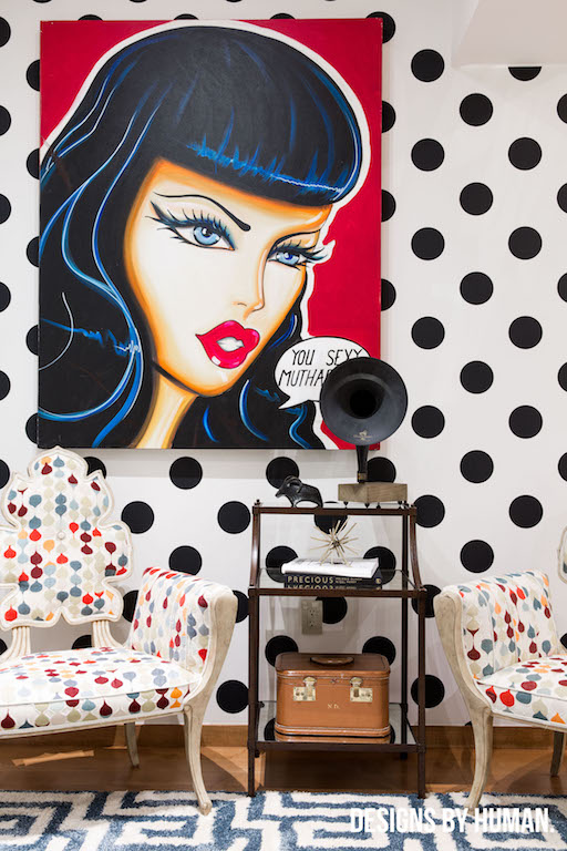
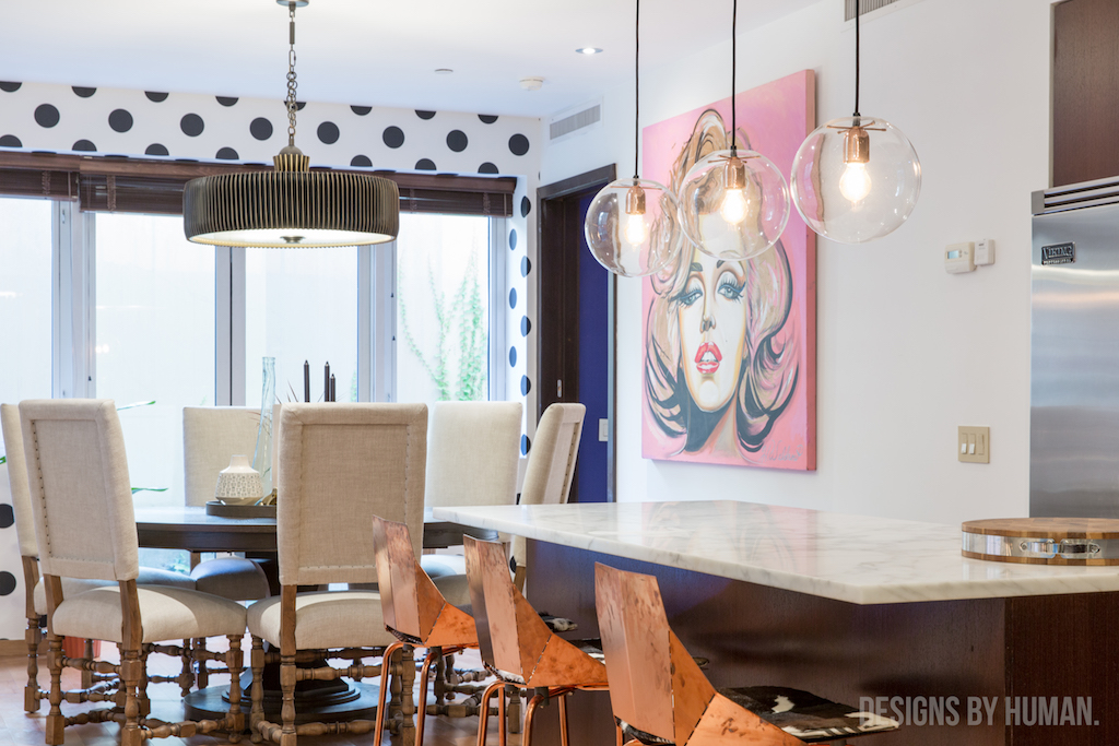
JH: The most important idea to remember is that colors don’t necessarily have to be matchy-matchy to be harmonious. Furthermore, non-neutral colors can be harmonious. I did a project, nicknamed the ‘Fun House’ here in Manhattan; there are so many different elements at play including antiques, pop art, patterns of many scales and bright colors. But the use of metals and woods brought that balance and harmony that was needed to make a cohesive and comfortable space. Having a space with all these elements takes a lot of trial and error and a unique eye for editing to mix all these different elements together. When done right, the outcome will look easy. But when done improperly, a space can feel contrived and incongruous.